

Making everything customer-centric: Multiple products fused into a single platform
Uzabase previously offered different B2B SaaS products under the respective brands of SPEEDA, FORCAS, and INITIAL.
However, when providing multiple products to a growing number of large enterprises for use across multiple divisions, the company began to feel that the products should be packaged as a comprehensive solution in order to maximize the value delivered to customers.
We started discussing the possibility of unifying product names in 2023. This was also in line with the organizational change implemented in January 2024 to adopt a customer-centric structure. We aimed for every aspect of our work to become customer-centric, from the product names and brands to how we deliver solutions.
Setting the rules: Cognitive sign + benefit/action
In the rebranding project, we ultimately decided to align our domestic SaaS product names under スピーダ (“Speeda”). Let’s look back on that process:
The first step we took in the project was to set ground rules for deciding the names.
We considered using frameworks such as the master brand strategy, sub-brand strategy, and multi-brand strategy.
Under a master brand strategy, a typical case would be to change the company name to SPEEDA, Inc. and rename all the products “SPEEDA XX.” In the case of NewsPicks, the name would be changed to “SPEEDA News.”
But we all agreed that SPEEDA News wouldn’t work. NewsPicks is already an established media brand. Many subscribers are clearly attracted to the NewsPicks brand, and changing the name of the media entails the risk of losing users.
We discussed different possibilities in a similar manner, narrowing down the options to establish the ground rules.

When setting the rules for the names, I thought the key would be the users’ benefit and/or action.
While researching similar cases in Japan and abroad, I found a notable example in Adobe’s corporate service suite, Adobe Experience Cloud. Its services are named by combining “Adobe” and the user’s benefit or activity, such as Adobe Analytics, Adobe Target, and Adobe Experience Manager, and they all used the same logo with a few exceptions.
By the way, the name “Adobe” comes from the name of a creek. I don’t think many people know this fact. This is proof that users actually don’t care about the meaning of the brand name itself. It’s purely a signal for recognizing the brand.
So we stopped asking the question of what the name itself should be. I suggested taking the approach of combining a cognitive sign with a term describing users’ benefits or actions. This ultimately became the ground rule for naming our products.
Early in the project, we also considered the idea of unifying the products under the INITIAL brand. The rationale was that INITIAL is less likely to be misread compared to a unique name like SPEEDA or FORCAS. INITIAL was also a widely recognized brand in the startup industry.
However, concerns remained: recognition in the startup industry shouldn’t be confused with our strategy, and while INITIAL is a general term, people might struggle to imagine what the service is for.
We then compared the online search volumes of SPEEDA, FORCAS, and INITIAL. Apart from “initial” as a general term, SPEEDA was searched the most. It is also the product used by the largest number of companies. If we were to choose a name based on level of recognition, we concluded that using SPEEDA made the most sense.
Actually, there was another name that we considered apart from SPEEDA: UB. Uzabase employees often call the company “UB” for short. Someone suggested changing the company name to “UB, Inc.” and naming the SaaS products “UB XX” based on a master brand strategy (excluding NewsPicks).
Behind this idea was the concern that choosing one name from among SPEEDA, FORCAS, and INITIAL might raise opposition from employees who felt attached to the others. We thought that the name UB, which all of us could stand by, might help retain that attachment even when the product names were changed. But looking back, this idea was ill-considered.
When we brainstormed with a management advisor and discussed the options of SPEEDA and UB, the advisor correctly pointed out how we were straying from a customer-centric approach. Outside of the company, people wouldn’t know what “UB” stood for. After that, we reconsidered the matter from a customer-centric perspective and settled on SPEEDA.
Separately from the rebranding project, we also decided to launch another project to establish a post-rebranding mission statement of the Speeda business as a customer-centric organization.
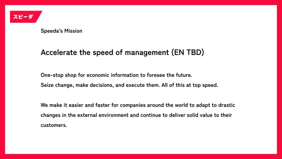
Speeda business mission statement
Japanese logo: Prioritizing clarity for the customer over cool visuals
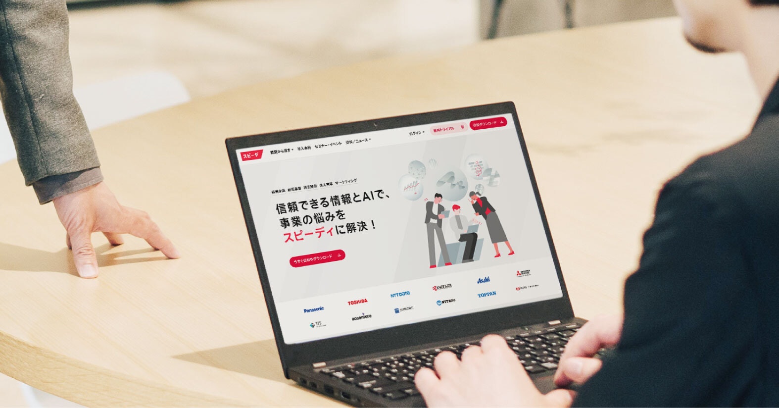
In the rebranding project, in addition to consolidating branding under Speeda, its logo for the Japan market was changed from alphabet to katakana (a form of phonetic writing in Japanese).
Behind this decision was the awareness that customers weren’t instantly recognizing the alphabet-based logo.
After the decision was made to align the product names under Speeda, the next question was whether the brand could be better recognized. We conducted a survey and found that among members of corporate planning departments of public companies in Japan, the recognition rate of SPEEDA was slightly below 50%.
For a product that has been in the market for 15 years, this was by no means a high rate, and we realized there was huge room for improvement.
And even before the rebranding project, we had been hearing from members engaging with customers that SPEEDA was often mispronounced. They had even suggested adding Japanese writing so that the name could be read correctly.
We had no doubts about using Speeda as the shared cognitive sign across the aligned product names, but were concerned that people might struggle to read it. So I suggested that if we were to consider complementing the logo with Japanese, we should rather create a logo written in Japanese from the beginning.
At that point, I had already let go of my ego around presenting something cool, together with anxiety that my colleagues might oppose the change. I was purely focused on choosing the best signal for users, and concerning Japan, I was sure that katakana would be recognized more quickly than alphabet letters.
The proposal to unify the brand and presenting Speeda in katakana was approved by Uzabase’s board of directors before the company-wide announcement at UB Day* held in December 2023. Shortly before that announcement, Ito joined the project as art director for the logo renewal.
UB Day: A quarterly all-hands event where the co-CEOs discuss the current state and future of Uzabase.

At the time I joined the project, the dominant idea was to create an alphabet-based logo. I was hoping to give the logo a sophisticated look distinct from the former logo, which was composed of capital letters. At that point, Sugahara-san started saying that katakana would be more recognizable.
My initial reaction was a feeling of disbelief [laughs]. I wanted to make something that looked really cool, and his idea seemed entirely contradictory to that approach.
But looking back, I’m glad that we decided on katakana. It’s much more recognizable for the customer. People can just see the name and put it in the search bar. I’ve come to believe that it’s more effective as a marketing strategy.
We started creating the katakana logo in January 2024. The team discussed ideas with co-CEO Sakuma on a monthly basis. Sugahara recalls that he felt a quiet pushback from the Design Division against the idea of a katakana logo, which was perceived as a deliberate turn to the uncool.
That was when Sakuma said something that instantly changed the mindset of the designers.
The third time we presented the logo ideas, Sakuma-san said, “We really need this switch to katakana.” He said that if we created a katakana-based logo in the SaaS market and succeeded, other companies would want to follow suit. “I see a future where Uzabase is the first to succeed, and everyone wants to copy us. Let’s be the pioneer.” Those words actually sparked my excitement.
I thought, I’d love to stick to cool design, but we might be able to do something crazy here, in a good sense. That’s when I became attached to the katakana idea.
With the cognitive sign portion fixed, it was time to decide the other component of product names: benefit/action. The project members suggested different ideas for product names and sought the honest opinions of colleagues on the business side. Rather than any pride-driven choice from the perspective of a service provider, they took the approach of finding names that users could easily understand. Discussions and deliberation continued for more than two months.
And finally, we settled on the following product names:
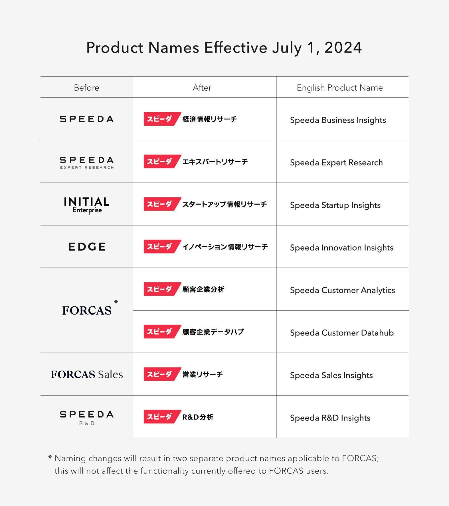
List of product names effective July 1, 2024
Stand out to serve: Waste no time in delivering value to the customer
We identified seven concepts that we wanted the renewed Speeda brand to be associated with: speed, customer-centric, cutting-edge, technology, business intelligence expert, trustworthy partner, and catalyst for innovation.
In the initial stage of creating sample images of the logo before UB Day in December 2023, Ito tried incorporating all seven factors in visual images. But when crafting the actual logo, he actually kept those factors out of his mind.
I was mindful of the seven factors at the beginning, but eventually came to think that what mattered was something else. I had the sense that the logo should convey a certain kind of feel, or impression.
In order to capture that feel, I explored how customers already perceived SPEEDA, FORCAS, and INITIAL, and considered how to work from there. Based on that input, I thought about the ideal perception of the new Speeda brand.
In order to identify perceptions to incorporate in the logo, I talked with colleagues who worked closely with customers to learn what they were feeling. The findings were then organized by the designers for further deliberation.
After listening to members of the Speeda business design division explain the dozens of logo ideas placed on the wall, Sakuma said, “Color might be the key.” That was when Ito realized that the logo must function as a tool for people to memorize Speeda as a cognitive sign.
The purpose of rebranding was to accelerate the growth of the entire business through a unified cognitive sign and wider recognition. This meant that the logo should be something both memorable and which stands out visually.
Ito says that this realization led to verbalizing the purpose of the logo, which defined the goal that he needed to pursue above all else.
When asked about the most important element of this logo, my answer is “functional beauty with clarity.” We explored how the logo can function as a logo in the clearest way. The desired recognition, impression, and emotional factors are all important, but first, we had to ensure that it functions effectively. I figured that the emotional factors could be enhanced through the details after that.
On that note, I think that in the beginning, we were focused on creating something symbolic. For instance, we discussed how to convey the sense of speed: we considered motifs such as light, the fastest element in the universe, and a falcon, the fastest living creature on earth. After that, we shifted to pursuing a logo that embodies functional beauty.
Sugahara and Ito both say that through this project, they came to believe that branding is about the stance of a company.
Since we have declared our transformation into a customer-centric service provider, I believe that demonstrating consistency in that stance is the best branding for Uzabase.
Being recognized by the users as quickly as possible and serving them in the fastest way possible—that is the goal of unifying the branding under Speeda and changing the logo.
nstead of having the customers wonder what SPEEDA, FORCAS, and INITIAL are and which service they might use, we should present Speeda Customer Analytics and Speeda Startup Insights in a way that is instantly understood, so that the customer can quickly choose the services they need.
A good brand defines employee behavior
Ahead of the official change, the rebranding was shared with existing customers in mid-May. While the majority of their reactions were positive, not all of them were, which was a natural outcome.
Some customers said that the new logo didn’t feel like Uzabase, and that we were letting go of our sophisticated image. To those comments, I reply with confidence: “You’re right. Uzabase is going to change for our users.”
The name Uzabase reflects the founders’ aspiration to keep creating services that become an infrastructure for the users, and this stance stays the same. In order to keep going in this direction, we need to change and adapt to the business environment.
With regards to the logo, I’ve heard positive comments from the designers at our customer companies, saying “The extent of change is striking” and “Uzabase made a bold move.” I’d thought that it was extremely important for people to feel the change, so I’m glad that we received such responses.
Some people might have negative feelings, but I believe that engaging with Speeda through various touchpoints will gradually enhance the familiarity of the logo’s design and color.
I hope the sales and CS (customer success) members will quickly feel the impact of the rebranding. That would boost their confidence in the brand.
It’s said that a good brand defines the behavior of the people who represent it. Disneyland and Starbucks are good examples. If the renewed Speeda brand successfully defines the behavior of Uzabase members, that means every one of us will be taking customer-centric actions.
Whether it is through our product or CS/sales activities, if the customers feel that people at Uzabase always act in a customer-centric way, that will further strengthen our brand.
Branding has external and internal aspects. At the Speeda business design organization, we are preparing the “Speeda identity” statement for internal reference.
We are establishing guidelines for what Speeda stands for, to help members understand the stance and conduct that best represents Speeda. I hope we can strengthen the Speeda brand by conveying those values to our customers.
Having a shared language will clarify standards for decisions and make work easier. Going forward, we would like to spread such shared language throughout the company so that we can measure our actions against the standards of the brand.
The information in this article is current as of the Japanese version's publication date (July 1, 2024).